The next step to understanding your data
At EGOS BI, we've talked a lot about improving your workflows using visual analytics, but you might be wondering, "What do they mean by Visual Analytics?"
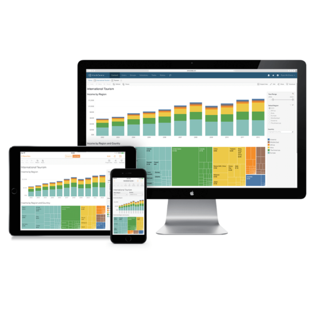
The term Visual Analytics, commonly used in topics related to BI and Big Data, refers to the science of rational analysis supported by a visual and interactive interface. That is, data analysis, using platforms like Tableau and Power BI, based on the results of a previously established process or strategy.
The process to generate a good visual analysis
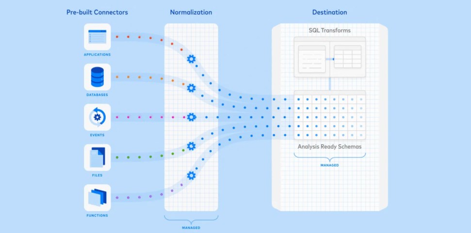
Its process combines automated and visual analysis methods that establish human interaction to understand the origin of your data.
The first step is to preprocess and transform the data to create different exploration representations.
This preprocessing involves:
- Data cleansing
- Standardization
- Grouping and integration of heterogeneous data sources.
The second step is to apply an analysis method, either automatically or visually:
- Automatic analysis methods. Data mining methods are used to create models from the original data. Once a model has been created, we must evaluate and improve the models, which can best be done by interacting with the data.
- Visual analysis methods, which allow interaction with automatic methods by modifying parameters or selecting other analysis algorithms.
Using the visual method improves the preliminary results obtained. Errors can be detected earlier, and better results can be achieved.
Why use visual analytics in your business?
Data visualization helps business leaders analyze various business reports. It allows them to gain greater insight into areas such as sales and marketing, and product interests. The analysis results reveal areas that need focus to increase productivity and profits.
Fast action
The human brain captures images better than table reports. Visualizations communicate data insights more quickly to decision-makers. As a result, decision-makers can take swift action that promotes business growth.
Identify visual patterns
A wealth of data always provides room for insight opportunities only when the data is visualized. Data visualization allows business leaders to identify and understand relationships between data. Patterns in insights help the organization focus on specific areas that need attention.
Discovering errors
Data visualization helps detect potential errors in data. Data analysts verify visualizations to identify erroneous data so that the data can be removed from the visual analysis and incorrect business actions can be avoided.
Understanding Visual History
Visualizations tell stories, and it's important to understand the story behind them. Designing visuals correctly helps the audience understand the story instantly. Visualizations should be designed as simply as possible so that the meaning and story are conveyed correctly.
Investigating business insights
Determining correlations between data is important for a company to outperform its competitors. As a result, data visualizations are key to uncovering these business insights and learning more about them. Detailed visual analysis helps executives steer the right path and achieve business goals.
Knowing the latest trends
Discovering the latest industry trends through data visualization helps organizations provide quality services and products. Furthermore, trends allow business executives to identify problems before they arise. And executives achieve greater business gains by staying on top of these trends.
Visual analytics tools and interactive visualizations help you better understand your data. There were only a few data sources available a decade ago, but now there are many. Previously, only IT professionals could evaluate the data. And non-IT professionals had to wait to receive their insight reports. Now, things have changed significantly with visual analytics on the scene.
Key benefits of visual analytics for businesses
- It enables better data exploration, improves data analysis, and minimizes overall business costs.
- Simplify complex information and result in better business decisions.
- Provides the capabilities to solve large, complex problems and produce accurate results.
- It offers different visualization trends and different data presentation modes.
- Visual analytics includes data visualization methods such as interactive bar charts, network graphs, and 3D scatter plots, among others. The analysis runs in code and can be compiled into any programming software platform. Furthermore, these methods analyze changes in a business environment in real time, enabling C-suite executives to make data-driven business decisions.
Large-scale companies and businesses have tons of data and information to process. It's difficult to collect, evaluate, process, and visualize this data manually. Therefore, data visualization and visual analytics tools are used to enable data-driven decision-making and meet organizational goals and objectives.
Want to integrate visual analytics into your workspace? Contact us to find out how!